Case study
Balance Budget
Building a clearer way to budget together
A household budgeting product that brings planning, transaction review and bank-connected account visibility into one practical workflow for couples.
Balance is a budgeting product for couples managing a household plan around joint accounts. The goal is straightforward: give households a clearer way to see what is planned, what has happened and what needs attention.
Our team has carried the product across design, application engineering and ongoing refinement. That meant shaping the core budgeting workflow, connecting it to account data, supporting the details of transaction review and building an architecture that could serve web and mobile experiences from a shared foundation.
Interface design studies
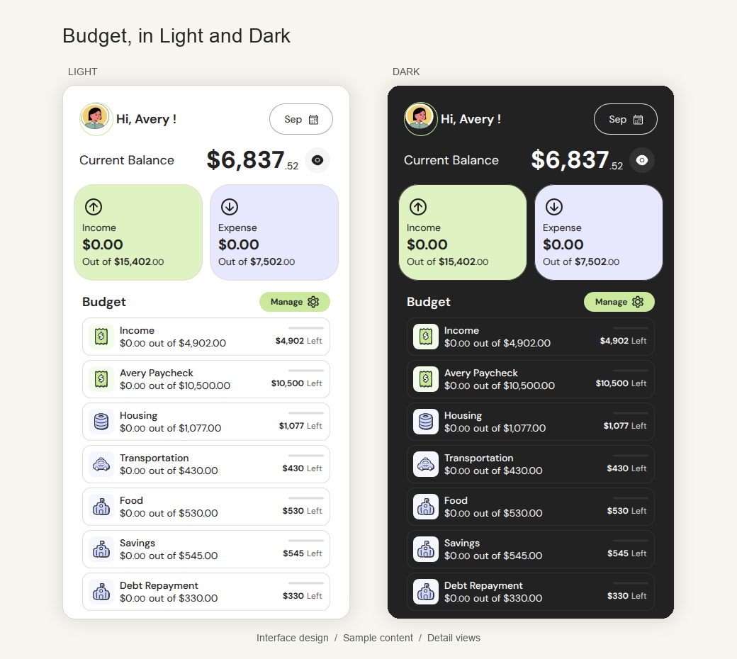
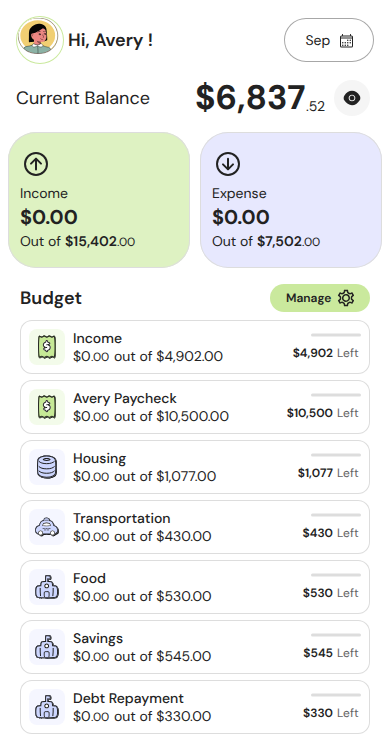
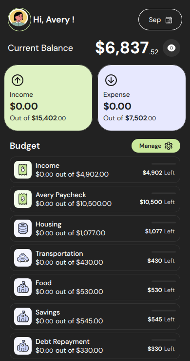
Design details in Light and Dark use sample content to show the budget hierarchy across the paired composition.
Start with the household plan
The product is organized around a simple household rhythm. People need to understand the plan for the month, review the activity that follows and know whether connected accounts still need attention. Balance treats those as related parts of one workflow rather than isolated tools.
That shaped both the product structure and the engineering work. Budget, Transactions and Accounts serve as the primary navigation areas, with clear indicators for transaction categorization and account issues. The result is a product that gives each decision a natural place to live.
Make planning concrete
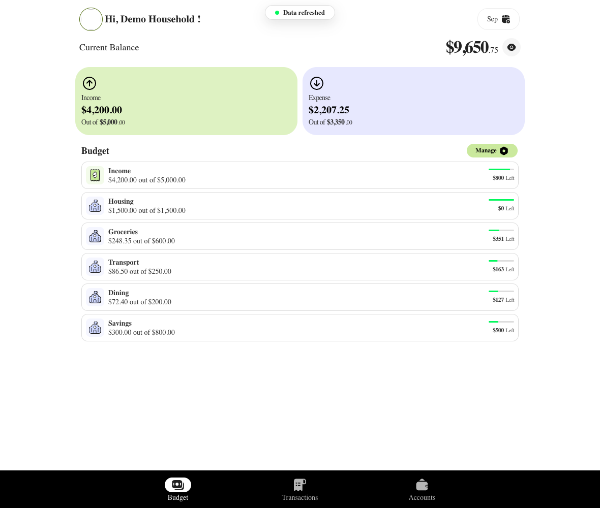
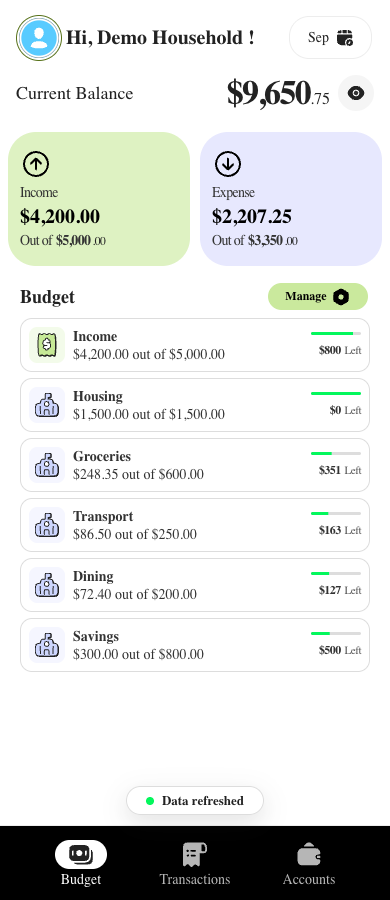
The budget view turns planning into a set of visible decisions. Income and Expense summary cards show activity values against budgeted totals, while the planning workflow shows allocation percentage, planned expenses, planned income and the amount left to allocate.
Categories are editable, so the plan can reflect the household using it. People can change names and amounts, add or remove categories and reorder them as priorities change. When planned expenses exceed planned income, the interface makes that over-budget state visible instead of hiding it behind a calculation.
Give transactions useful context
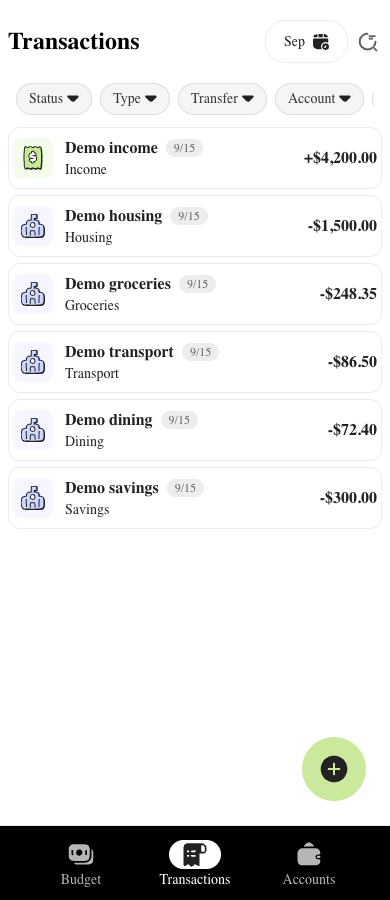
Transaction review is designed for the questions people actually ask after money moves. Within a selected month, users can search transaction names, merchants and notes, then narrow the list by account, income or expense, transfer, categorized or uncategorized status, profile and manual or bank source.
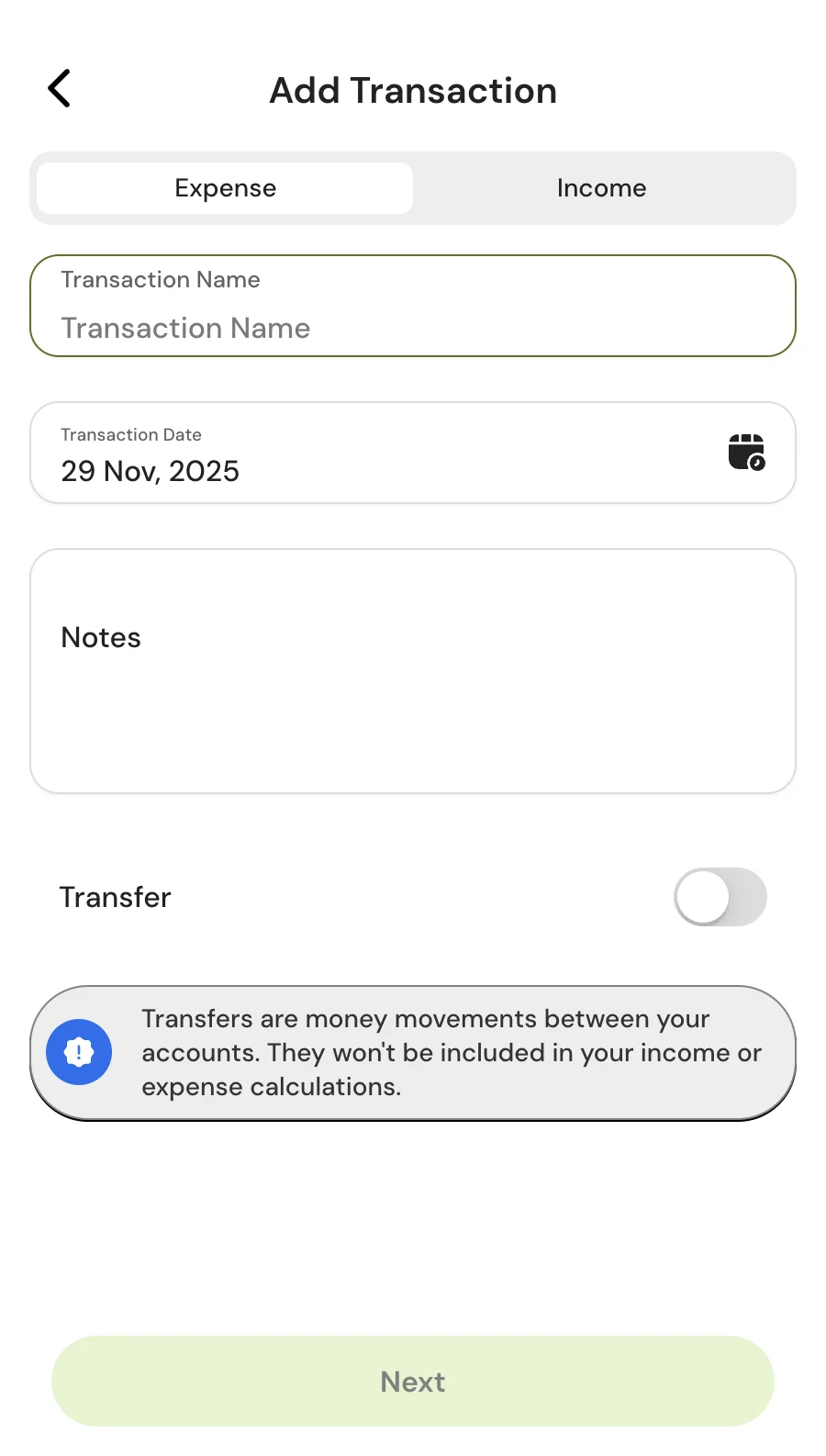
The workflow also supports selection mode and bulk categorization, along with a separate path for adding a transaction manually. These are practical controls for cleaning up and reviewing activity without suggesting that the product can replace the household's judgment.
Make connected accounts understandable
Account connections need more than a balance number. Institution cards show when information was last updated and surface connection errors, giving users a clearer explanation when an account needs attention.
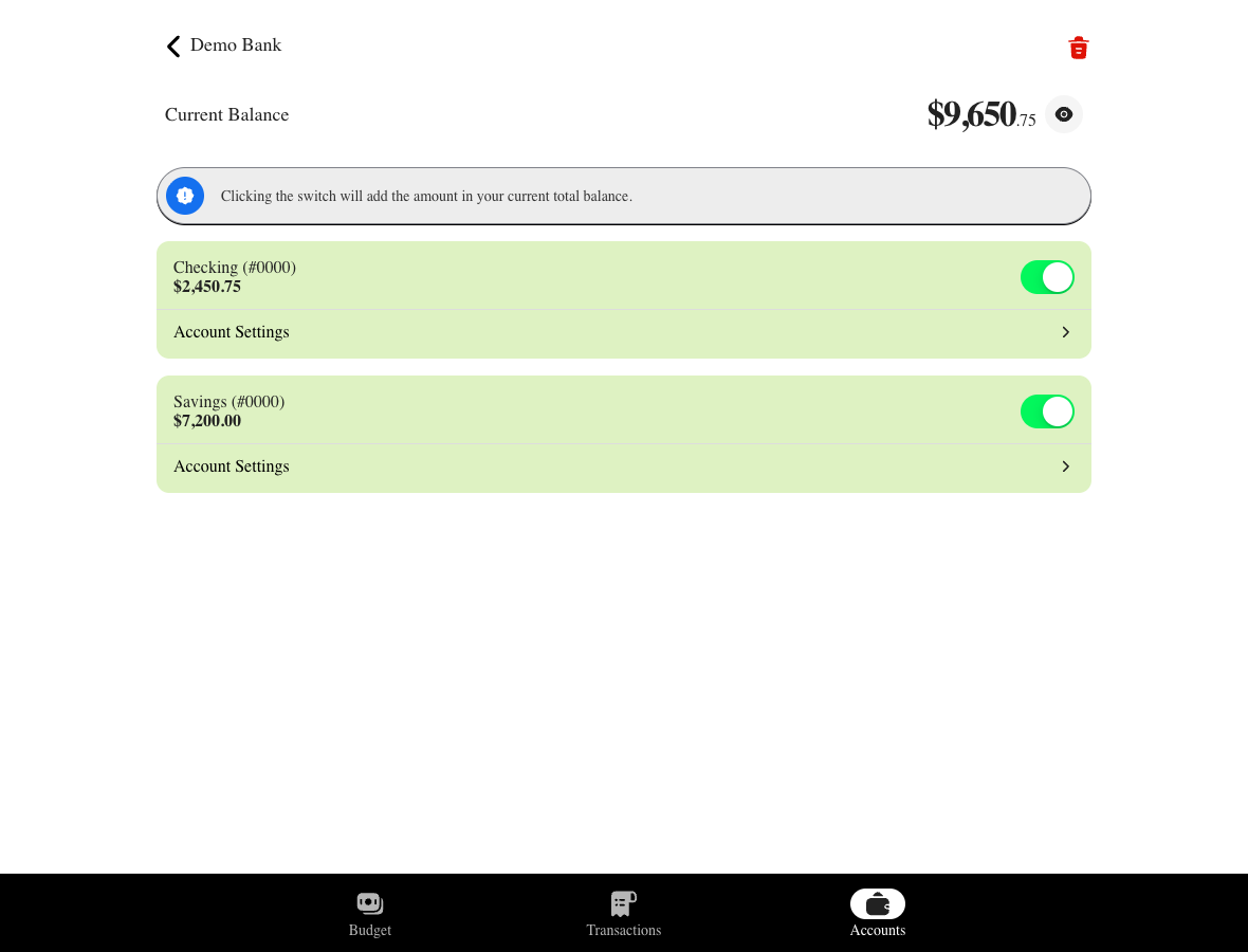
Inside an institution, users can see individual account balances and control which accounts contribute to the displayed total balance. That gives households more control over how their connected accounts are represented in the product.
App views
These existing app captures show selected app views with fictional test data.
Design for the messy parts of bank connections
The bank-link flow supports both starting a new connection and reconnecting an existing institution item. Web redirects and native-specific session handling are treated as different parts of the experience, because the same connection flow has to behave properly across platforms.
We also added a guard against duplicate bank-link initiation. A shared active-session flag helps prevent overlapping sessions, while the implementation distinguishes iOS cancellation, startup fallback and normal session completion. It is a small engineering detail, but it reflects the larger goal: make edge cases explicit before they become confusing product behavior.
One product across web and mobile
Balance uses Vue, Ionic, Pinia and Vite for a shared frontend, with Capacitor packaging the web build for iOS and Android. Platform-specific integration code handles native behavior where the shared experience needs a different implementation.
Behind that, TypeScript handlers and AWS CDK infrastructure support Node.js Lambda functions, a REST API, Cognito authorization and DynamoDB storage. The architecture keeps the product workflow connected from interface to backend, while leaving room to refine individual parts without rebuilding the experience separately for every platform.
Keep refining the system behind the product
The visual system is still being refined alongside the product. Native Penpot work is bringing linked components, semantic tokens and Light and Dark themes into a more consistent structure, with saved Budget screen fixtures helping the team evaluate the direction across representative planning screens.
The process creates a stronger foundation for future product work: establish reusable decisions, apply them to representative screens and keep the design system close to the workflows it needs to support.
Balance shows the kind of work DrawChicken is built to do: connect product decisions to useful interface details, carry those decisions through web and mobile engineering and keep improving the system as new needs appear. The work continues in the places that matter, from clearer planning states to more explicit account connection edge cases and a stronger visual foundation.
← All projects